
How to change the look of Contact by Zaweba
Change how Contact by Zaweba looks with a theme, Row layout for list rows and the reading pane position, plus density and box colours.
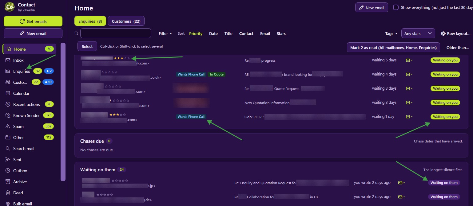
You change the look of Contact by Zaweba in three main ways. Pick one of the six themes for the colours, use Row layout to choose which fields appear on each list row, and set the reading pane to Right, Bottom or Off. Density settings, box names and highlight colours fine-tune the rest.
Choosing colours with a theme
Contact has six named themes: Midnight, Aubergine, Slate and Lime, Daylight, Lavender and High contrast. The default look is deep purple with lime yellow. Daylight suits bright rooms, and High contrast has a black background for easier reading. Each theme is checked for contrast, so you can pick on taste without worrying about readability.
A theme changes colours only. Everything stays where it was, so you can switch freely.
Deciding what each row shows
Row layout chooses and orders the fields shown between a record's name and its status. The choices include stars, tags, last message, chase date, notes, order number and message count.
Pick the two or three that help you decide what to do without opening a record. A shop might show order number and tags. A tradesperson chasing quotes might show chase date and stars. Someone who reads a lot of mail might put last message first, so the latest words are visible on the row. Fewer fields keep rows easy to scan.
Each list also remembers its own sort, so Customers can stay alphabetical while Enquiries stays newest first.
Placing the reading pane
Contact uses an Outlook-style layout, with a ribbon, a folder pane with Mail, Calendar and People, and three panes on every list. The reading pane can sit Right, Bottom or Off.
Right suits wide screens, keeping the list and the email side by side. Bottom suits narrower screens and rows with several fields, since the list keeps its full width. Off gives the list the whole window, which is handy while filing a busy Inbox.
Opened emails and compose open in windows of their own, so you can arrange them on screen as you like, and minimising Contact leaves them alone.
Density, names and highlight colours
Density settings change how tightly rows are packed. Compact fits more on screen; roomier rows are easier on the eyes.
You can rename every box in the navigation and give each one of ten highlight colours. Boxes light up with N new when mail arrives after you last looked, so colouring the boxes that matter most makes their counts stand out. The colours are tuned for each theme.
A simple order to work in
Start with the theme, since it sets the overall feel. Then place the reading pane to suit your screen. Then set Row layout on the lists you use most, and finally adjust density and box colours.
Give each change a day before changing it again. Settings that seem odd at first often settle in, and constant tweaking makes it harder to build habits.
Taking your look to another PC
File > Export settings writes your settings, rules, templates, tags, customer folders and list layouts to one JSON file. Import it on another PC, check the preview of what would change, and choose merge or replace, so your new machine looks and works the way you are used to.

