
Finding your way round the Outlook-style layout in Contact
Contact by Zaweba has a ribbon, a folder pane with Mail, Calendar and People, three panes on every list and a reading pane you can put right, bottom or off.
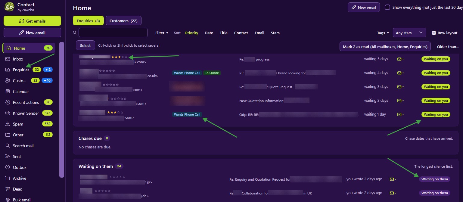
Anyone who has spent years in Outlook will feel at home in Contact by Zaweba within minutes. Version 4.0 gave it an Outlook-style layout: a ribbon along the top, a folder pane down the side, and lists with a reading pane. The idea is simple. If you already know where things are in your email program, you should know where they are here.
The ribbon and the folder pane
The ribbon has four tabs, File, Home, View and Help. File is where the commands that deal with all your data live, such as File > Export settings and File > Back up everything, so the things you do once in a while are kept out of the way of the things you do every day.
Down the left side is the folder pane, with a module bar for Mail, Calendar and People. Mail is where the Inbox, enquiries, customers and mail folders live. Calendar holds appointments, reminders, chase dates and scheduled sends. People is about the people you deal with rather than the mail. Switching module is one click, so you can check tomorrow's appointments and come straight back to the email you were answering.
Three panes and the reading pane
Every list has three panes: the folder pane, the list itself, and a reading pane. The reading pane can go Right, Bottom or Off.
Right suits a wide screen. The list sits in the middle with a narrow set of columns, and the email or conversation fills the right-hand side, so you read without leaving the list.
Bottom suits a narrower screen or longer rows. The list keeps its full width, which helps if you have set Row layout to show several fields such as tags, last message and chase date, and the reading pane sits underneath.
Off gives the list the whole space. It is handy when you are sorting and filing rather than reading, working down the Inbox with the filing buttons.
Density settings change how tightly rows are packed. Compact rows fit more on screen; roomier ones are easier on the eyes.
Search and windows of their own
The search box sits at the top, and Ctrl+E jumps to it from anywhere, which is the same shortcut Outlook uses. Type and the current list narrows.
Opened emails and compose open in windows of their own. That sounds like a small thing, but it changes how you work. You can keep a long email open on one side while writing a reply on the other, or leave a half-written email open while you look something up in another record. Minimising Contact leaves those windows alone, so tucking the main window away doesn't hide the email you are in the middle of.
Setting it up to suit you
Choose the reading pane by screen. On a laptop, Bottom or Off often works better than Right; on a wide monitor, Right makes the most of the space.
Set density once you have Row layout sorted. If rows show several fields, a roomier density stops them looking cramped.
Learn Ctrl+E. Search is the fastest way round a big list, and having it under your fingers saves a lot of scrolling.
Use the module bar rather than hunting through menus. Mail, Calendar and People cover most of what you do.
How it fits with the rest of Contact
The layout is the frame; the features sit inside it. Home shows who is waiting on you, the Inbox holds new senders to file, and every list remembers its sort and filters. Themes change the colours, from the deep purple and lime default to light and high contrast choices, without changing where anything is. Contact still sits beside your email program rather than replacing it, but being laid out the same way means moving between the two feels natural.

