
Choosing a theme in Contact by Zaweba
Contact by Zaweba has six named themes, from Midnight and Aubergine to Daylight and High contrast, each checked so text stays readable.
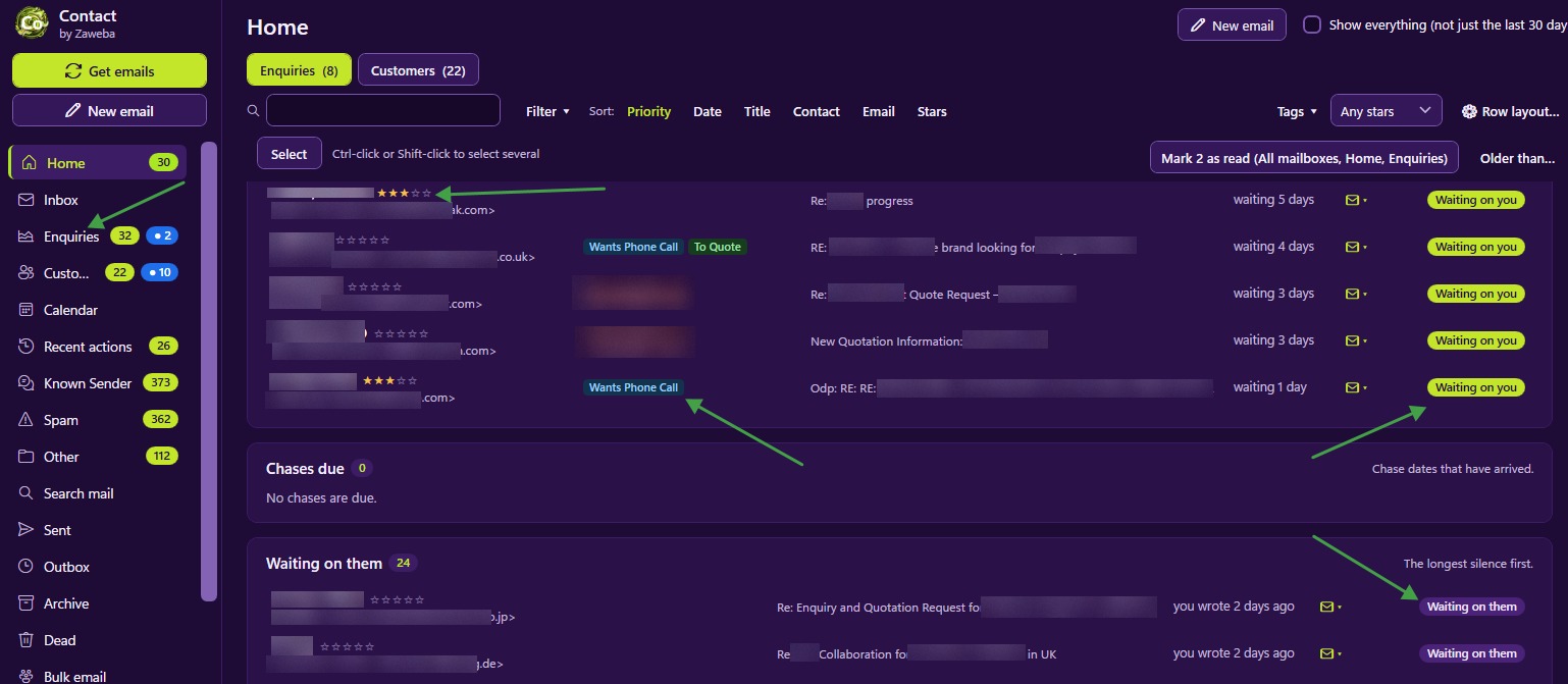
Colours matter more in a program you keep open all day than in one you visit now and then. Contact by Zaweba comes with six named themes, so you can pick the one that is easiest on your eyes and suits your room, the time of day and your screen.
The six themes
The themes are Midnight, Aubergine, Slate and Lime, Daylight, Lavender and High contrast. The default look is deep purple with lime yellow, a dark scheme that is calm to sit in front of and makes highlights stand out.
Darker themes suit long sessions and dim rooms. They cut glare in the evening and keep bright accents easy to spot.
Daylight is the choice for bright offices and anyone who prefers dark text on a light background, the look most documents and websites use. Lavender and Slate and Lime are there for anyone who wants something between the two moods, so try them side by side.
High contrast has a black background and is there for easier reading. It is the theme to try if text ever looks faint or you find yourself leaning towards the screen.
Checked for contrast
Every theme is checked for contrast so text stays readable. A theme can look striking in a screenshot and still be tiring to read for hours if the text is too close in colour to its background. Checking each one means you can choose on taste without paying for it in eye strain.
The stars on rows and in record headers keep one gold style whichever theme you use, so a five-star customer looks like a five-star customer everywhere.
Highlight colours that follow the theme
You can give each box in the navigation one of ten highlight colours, so the boxes that matter stand out when they light up with new mail. Those highlight colours are tuned for each theme. A colour chosen in a dark theme still reads clearly if you switch to Daylight, and the other way round, so you don't have to redo your colours when you change theme.
Picking a theme that works for you
Try each one for a full day, not a minute. First impressions favour bold colours, but what matters is how a theme feels at four in the afternoon.
Think about where you sit. A screen by a sunny window often needs a light theme; a corner of a dim office often suits a dark one.
Consider the people around you. If several people use Contact, each on their own PC, each can pick the theme that suits them.
Use High contrast without hesitation if it helps. It is there for comfort, not as a last resort.
If you move between PCs, File > Export settings writes your settings, rules, templates, tags, customer folders and list layouts to one JSON file, and Import on the other machine brings them across after showing what would change.
How themes fit with the rest of the look
A theme changes colours, not layout. The ribbon, the folder pane with Mail, Calendar and People, and the reading pane Right, Bottom or Off all stay where they are. Row layout and density settings decide what each list row shows and how tightly rows are packed. Emails from colleagues show their sender as an inverted pill in every theme, so they stand apart from customers whatever the colours. Put together, you can tune Contact to look the way you want without losing your bearings.

