
Can I use variable fonts in a vector editor?
Vectornation by Zaweba supports variable fonts, with weight and width sliders and named instances in the Character panel, so any in-between style is yours.
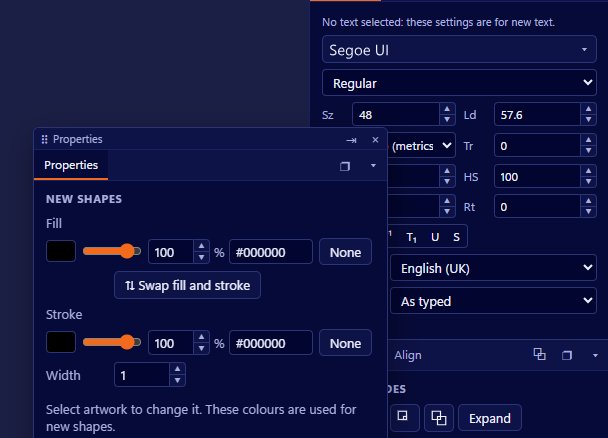
They work fully. Vectornation by Zaweba supports variable fonts, and you set them in the Character panel with sliders for weight and width or by picking one of the font's named instances. Instead of choosing between Regular and Bold, you can set the weight anywhere in between and fine tune it until the type looks right at the size you are using.
Variable fonts pack a whole family into one file. Rather than a separate file for each weight, the font stores a range along one or more axes, and the program draws any point along them. That is useful for designers, because the exact weight a headline needs is rarely one of the four or five a traditional family ships with.
Installing a variable font
A variable font installed in Windows. Many modern typefaces come in a variable version, often marked as such in the file name. Install it the normal way and Vectornation picks it up, along with every other font on your PC, in its font manager.
Then make some text with the Text tool (T), select it and open the Character panel.
Setting weight and width
When the selected text uses a variable font, the Character panel shows sliders for the axes the font offers. Weight makes the strokes lighter or heavier. Width makes the letters narrower or wider. Drag either slider and the text updates on the canvas as you go.
Named instances are the font designer's own presets along those axes, the familiar names such as Light, Medium, SemiBold or Condensed. Picking one is a quick way to start, and you can move the sliders from there if the preset is nearly right.
Where variable fonts earn their keep
Headlines at large sizes often look heavier than the same weight in body text. With a variable font you can take a few units off the weight for the big line so it matches the smaller text visually.
Width helps with stubborn layouts. If a product name is slightly too long for a label, a small step narrower on the width axis can fit it without squashing the letters, which is what you get when you simply scale text horizontally. The font draws properly narrower letterforms instead.
For logo work, a variable weight lets you test many versions of a wordmark quickly. Duplicate the text a few times, set each to a different weight, and compare them side by side on one artboard.
Variable fonts also suit brand work where a family needs to feel consistent across a poster, a web graphic and small print, with each use at its own carefully chosen weight.
Recording the settings you choose
Write down the values you settle on. If a brand uses a weight of something between Medium and SemiBold, record the number in the brand notes so the next piece matches. Vectornation's Libraries panel can keep text styles in local files for every drawing, which is a tidy home for those settings.
Check the licence of the font before you embed or outline it for a client. And when you send artwork to a printer who might not have the font, consider whether to outline a copy of the text. Keep a live version for yourself so the sliders still work later.
If your font is not variable
If you only have a static family, you can still choose its fixed weights in the usual way. Faking an in-between weight by adding a stroke to the text is a common trick but it rounds corners and fills counters, so a real variable font is better wherever you have one.
Vectornation by Zaweba is free software for Windows, works offline and needs no account. It also shows fonts made in Font by Zaweba, so a typeface you design yourself sits in the same list as everything else.

