
See-through colours and colour opacity in Vectornation by Zaweba
In Vectornation by Zaweba every colour can have its own opacity, typed as #RRGGBBAA or rgba(), and it is kept in SVG, .vecz and PDF files.
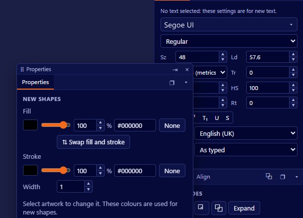
Opacity is usually something you set on a whole object. Vectornation by Zaweba goes a step further: every colour can be see-through on its own, separate from the object's opacity. A shape can have a half-transparent fill and a fully solid outline, or a solid fill with a faint stroke, without splitting it into two objects.
How you enter it
Colour boxes take three kinds of value. #RRGGBB is the familiar six-digit hex colour, solid. #RRGGBBAA adds two more digits for opacity, so the same colour can be given transparency in one string. And rgba() takes red, green, blue and an opacity value, as written in web style sheets. That means you can paste a colour straight from a web developer's notes or a style guide, transparency and all.
Each colour box shows a checkerboard chip, so you can see at a glance that a colour is partly see-through, and a slider for adjusting the opacity without typing. The checkerboard is a simple idea that prevents a common confusion: a pale colour and a transparent colour can look alike over white, but the checkerboard shows which is which.
How it is saved
Colour opacity is saved as fill-opacity and stroke-opacity in SVG and .vecz, Vectornation's own compressed SVG format, and as /ca and /CA in PDF. Those are the standard places those formats keep fill and stroke transparency, so the effect travels with the file. A web developer receiving your SVG gets the same see-through fill you designed, and a PDF opened elsewhere shows the transparency on the right part of each object.
Colour opacity or object opacity
Object opacity, set in the Transparency panel along with blend modes and opacity masks, fades everything about an object together: fill, stroke and effects. Colour opacity fades just one colour. Use object opacity when the whole thing should look ghostly or sit behind other artwork. Use colour opacity when one part should be see-through and the rest should stay firm.
Some jobs that suit colour opacity: a highlighter mark over text, with a see-through fill and no outline; a map with tinted regions whose borders stay crisp; a button for an interface with a soft background and a solid edge; overlapping circles in a diagram where the overlaps should show. Each of these would otherwise need extra shapes, and extra shapes are extra things to keep in line when the design changes.
Screen, print and stray settings
Transparency on screen and transparency in print behave differently. On screen, a see-through colour blends with whatever is behind it. In print, the result depends on how the file is prepared for the press. Before sending see-through artwork to a printer, look at the separations and overprint previews and follow the printer's guidance. For the screen, check the result over the backgrounds it will really sit on, not just over white.
It is also easy to forget a colour has opacity set, especially when copying a colour from one shape to another. If a colour looks paler than it should, check the checkerboard chip and the slider before assuming the colour itself is wrong.
Colour opacity is a small control with a big effect on how cleanly you can build artwork. Once you are used to it, you'll find fewer stacked duplicate shapes in your drawings and simpler files to hand on.

