
How to match Pantone colours in a design
Load your own colour books (.ase, .acb, .aco, .gpl) into Vectornation by Zaweba and snap colours to the nearest entry. No Pantone data is shipped.
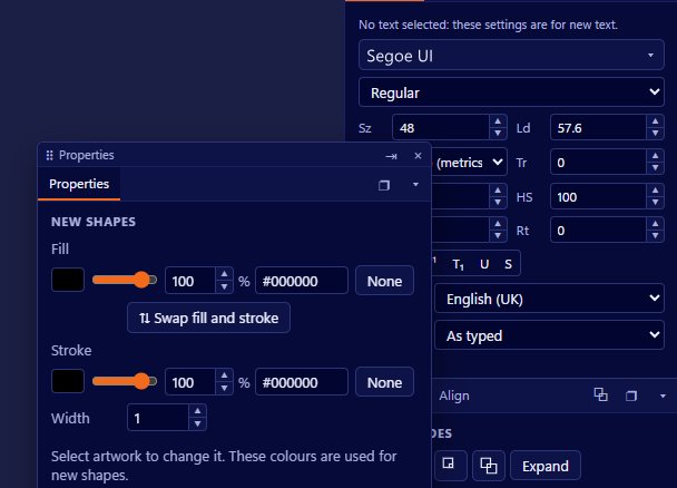
Load the colour books you already have into Vectornation by Zaweba and pick from them, or snap your existing colours to the nearest entry. The app reads .ase, .acb, .aco and .gpl books. It does not ship any Pantone data itself, so the books come from you, from your printer or from the brand you are working for.
Pantone is the best-known matching system for spot inks: named, numbered colours that printers mix to a recipe so the same colour comes out the same each time. Brand guidelines often give a Pantone reference for the logo colour, and printers ask for one when a job is printed with spot inks rather than four-colour process.
Finding a colour book
A colour book file. If you have a licensed book from another design program, it will usually be in .acb or .ase form. Brand teams often hand out an .ase file with their colours. Printers sometimes have their own book of the inks they stock. GIMP palettes in .gpl and Photoshop swatches in .aco load too.
The reference from the brief, so you know which entry you are looking for.
Loading the book and matching
Open the spot colour books panel and load the book. Its colours are then available to pick. Choose the one named in the brief and apply it to the objects that should print in that ink.
If the artwork already exists with colours that are only roughly right, select the objects and use snap to nearest. Vectornation finds the closest colour in the loaded book and swaps it in. This is especially useful after tracing a logo from a picture or opening a file somebody built by eye.
Keep the matched colour as a spot swatch. Vectornation's swatches support global and spot colours, and a global swatch updates every object using it when you change it, so the whole design stays consistent.
Checking the match
On screen, spot colours are only a simulation. Use View > Colour proofing to soft-proof with the printer's CMYK profile if the job will actually print in process, so you can see how far the process version sits from the spot ink.
Separations preview (Window > Print and output) shows whether each spot colour really is a separate ink, and the Inks counter shows how many colours the design uses. If the count is one more than it should be, there is usually an object still in the old, unmatched colour.
For the final word, a printed swatch book or a press proof is the only way to judge a spot ink by eye. The Proof sheet in Vectornation has a sign-off box so the client can approve the colours on paper.
Keeping colours consistent across jobs
Put the matched colours in the Libraries panel, which keeps colours, graphics and text styles in local files for every drawing, with import and export. Then the next leaflet or label for the same client starts with the right inks already in place. Swatch files in ASE, ACO, GPL and CSS can be exported too, which helps when someone else is building the web version of the same brand.
A note on names
Colours in a book carry the names from that book. Keep them unchanged, because printers rely on the name to know which ink to mix. Renaming a spot colour to something friendly can lead to the wrong ink on press.
Vectornation by Zaweba is free software for Windows that works offline and needs no account.

