
Tabs, hyphenation and justification in Vectornation
Tab stops with leaders, UK English hyphenation, justification, the every-line composer, hanging punctuation and optical margins in Vectornation by Zaweba.
Menus, price lists and dense paragraphs are where text in a design either looks professional or looks rushed. Vectornation by Zaweba includes the controls that make the difference: tab stops with leaders, hyphenation, justification settings, the every-line composer, hanging punctuation and optical margin alignment. They are quiet tools, but they decide how even and readable a block of text looks.
Tabs and leaders
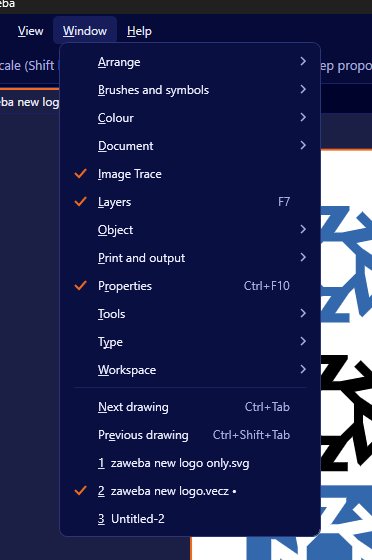
Window > Type > Tabs (Ctrl+Shift+T) opens the Tabs panel. There are four kinds of stop: left, centre, right and decimal. Left and right are the everyday choices, centre suits column headings, and decimal lines numbers up on their decimal point, which is exactly what a price list or a table of measurements needs.
Leaders fill the space before a tab with a repeated character, usually dots. A menu that reads dish name, a row of dots, then the price, is built with a right or decimal tab and a dotted leader. It guides the eye across the gap and looks tidy without drawing any lines by hand.
Use tabs rather than spaces to line things up. Spaces never quite align, because characters have different widths, and they break as soon as the text changes.
Hyphenation
Hyphenation breaks long words at the end of a line, which matters most in narrow columns and justified text. Vectornation uses UK English hyphenation patterns, so words break where a British reader expects them to. There are settings to control how it behaves, and you can add discretionary hyphens to show where a particular word may break if it needs to, without a hyphen appearing when it does not.
Discretionary hyphens are useful for names, brand terms and long technical words that the patterns may not handle as you would like.
Justification settings
Type > Justification sets word and letter spacing for justified text. Justified text has straight edges on both sides, and the space has to come from somewhere. Allowing a little flexibility in word spacing, and a very small amount in letter spacing, gives even lines without obvious rivers of white space running down the paragraph.
If justified text looks gappy, try allowing hyphenation, widening the column slightly or adjusting these settings before reaching for manual fixes.
The every-line composer
The every-line composer looks at a whole paragraph when deciding where to break lines, rather than one line at a time. The result is more even spacing across the paragraph, with fewer very tight or very loose lines. For body text it is usually the better choice.
Hanging punctuation and optical margins
Hanging punctuation lets quotation marks and similar marks sit just outside the edge of the text block, so the letters themselves form a clean edge. Optical margin alignment goes further, nudging the edges of lines so that round and pointed letters and punctuation look aligned to the eye, even though they are not mathematically level. Both make headings and pull quotes look more finished, and they are subtle enough that readers never notice them, only that the text looks right.
Bringing them together
For a menu, set up tabs and leaders first, then apply a paragraph style so every line behaves the same. For a justified column, turn on hyphenation, use the every-line composer, check the justification settings and add hanging punctuation. In both cases, look at the text at its real size and read it through before you sign it off, as a single awkward break is easy to miss on screen.
These are the details that separate typeset text from typed text, and having them in Vectornation means print pieces with a lot of copy can stay in the same app as the artwork.

