
Setting the palette and levels for Image trace in Vectornation
Control Image trace colours in Vectornation by Zaweba with automatic, limited, full tone, swatch or picked palettes, and tune levels and noise first.
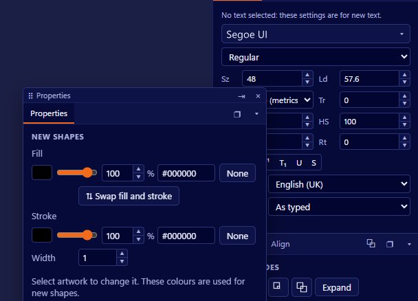
Image trace turns a picture into vector shapes, and the quality of the result depends heavily on the colours it is allowed to use. Vectornation by Zaweba gives you close control over that through the trace palette, and over the picture itself through levels and adjustments that work before tracing begins.
Getting these right is usually the difference between a messy trace and a clean one.
Choosing a palette
The palette decides which colours the trace can use. There are several modes.
Automatic lets the trace decide, which is a sensible first try on an unfamiliar picture.
Limited restricts the number of colours, which is the best choice for logos, flat illustrations and anything that started as a few solid colours. Fewer colours mean fewer shapes and a cleaner result.
Full tone keeps a much wider range of colours, for photographs or artwork with many shades where you want the trace to stay close to the original.
Swatches uses the colours in your swatches. If you are tracing a logo for a brand whose colours you already have, this gives a trace in exactly those colours rather than near matches.
You can also pick colours directly from the image, telling the trace which colours to use by choosing them from the picture itself.
Including, leaving out and merging colours
Within the palette you can include or leave out particular colours and merge colours together. Leaving out the background colour is a common move, so the trace produces only the artwork you want. Merging two very similar colours, such as two shades of white caused by uneven lighting in a scan, gives you one area instead of two.
Levels and adjustments before tracing
A scan or a photograph rarely has ideal contrast. The levels controls, with a histogram to show the spread of tones, let you set the darkest and lightest points so the picture uses its full range. Gamma adjusts the midtones.
Brightness, contrast and saturation make broader changes. Raising contrast often helps a faint drawing trace cleanly. Lowering saturation can stop slight colour casts creating extra shapes.
Posterise reduces the picture to fewer tones before tracing, which helps when you want flat areas of colour.
Noise reduction smooths out speckles from scanning, compression or grain. Without it, every speck can become a tiny shape in the result.
A practical order
Start with the picture: set levels, then contrast, then add noise reduction if the scan is speckled. Then choose a palette. For a logo, use limited or swatches. For a photo, full tone. Then refine with include, leave out and merge.
Look at the result at its real size and zoomed in. If there are many tiny shapes, increase noise reduction or reduce the number of colours. If details are missing, relax them.
Common pitfalls
Tracing a low contrast, noisy scan without adjusting it first is the most common problem. Five minutes on levels and noise reduction saves much longer cleaning up shapes afterwards.
Using too many colours for a simple logo is another. If the original had three colours, ask for three, or use swatches, and the result will be far cleaner.
How it fits with the rest of Image trace
Palette and levels are the preparation stage of Image trace in Vectornation. The trace then builds shapes from the colours you allowed. With a well prepared picture and a sensible palette, the trace leaves less tidying for you to do, and the shapes are easier to edit afterwards.

