
Using variable fonts at any weight in Vectornation by Zaweba
How to use variable fonts in Vectornation by Zaweba, setting any weight or width with Character panel sliders or picking named instances, with tips.
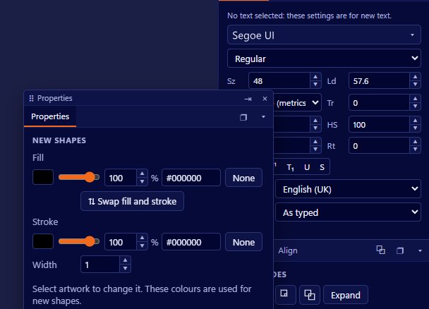
A variable font packs a whole range of styles into one file. Instead of separate fonts for light, regular, bold and black, it holds a continuous range, and you can pick any point along it. Vectornation by Zaweba supports variable fonts at any weight or width, set with sliders in the Character panel or chosen from the font's named instances.
Sliders in the Character panel
When you choose a variable font, the Character panel shows sliders for the font's axes, such as weight and width. Drag a slider and the selected text changes smoothly. You are not limited to the steps a type designer happened to name; if regular is too light and bold too heavy, you can sit exactly between them.
This is particularly useful for headings and logos. A wordmark can be set at precisely the weight that balances with a symbol, and a heading can be made slightly narrower to fit a line without changing size.
Named instances
Most variable fonts also define named instances, such as Light, Regular, Semibold and Bold, which match the styles you would find in a traditional family. Choosing a named instance is a quick way to get a standard style, and a good idea when you need to match a style used elsewhere in a brand.
Use named instances for body text and everyday work, and the sliders when you need something in between.
Keeping weights consistent
The freedom of a slider is also a risk. If every heading in a document is set by dragging, you will soon have headings at slightly different weights that look nearly but not quite the same. Paragraph and character styles solve this: set the weight once in a style and apply it everywhere.
Write down the values you use for a brand's key styles, or keep them in a style, so you can match them in later jobs.
Width for fitting text
Where a font has a width axis, it gives you a cleaner way to fit text than squashing it. Scaling letters horizontally distorts them, making vertical strokes thinner than horizontal ones. Changing the width axis uses the type designer's own narrow and wide shapes, which keep their proportions. For signs, labels and packaging where space is tight, that is a real improvement.
Variable fonts and the rest of the type tools
Variable fonts work with the rest of the type features in Vectornation, including OpenType features, kerning from the font and live text effects. Because the text stays live, you can adjust the weight of a heading after adding a shadow or setting it on a path, and everything follows.
When you are ready to send work to a printer or a cutter that needs outlines, create outlines from the text at the end, after the weight and width are settled.
Choosing a variable font
Not every font is variable, and not every variable font has the same axes. Some offer only weight, some weight and width, and some have other axes. Font lists in Vectornation show each family in its own font, which helps you browse, and the Character panel will show the sliders a variable font offers once you choose it.
A good variable family can replace several separate fonts in a project and gives you more control than any one of them. For anyone who sets a lot of headings, it is one of the most useful type features to learn.

